UPP 462 | Fall 2022
Final Project Showcase
In Fall 2022, the class produced 12 team and individual projects on a variety of topics. The purpose of this final project is for students to demonstrate their ability to integrate multiple advanced GIS tools (e.g., Network Analyst, ModelBuilder, Python, Spatial Statistics, 3D Mapping, and Spatial Analyst) to address some questions – hypothetical or real – of a geospatial nature. Students have several weeks at the second half of the semester to develop research questions, investigate the topic of their interest, explore GIS tools to address their questions and produce the final visuals. The final result includes an ArcGIS StoryMap report where maps and additional information are used to illustrate methods and communicate findings. Thanks to all the students for your hard work during the semester.
Instructor - Anton Rozhkov
1. Access to Green Economy Firms in the Chicago Region Heading link
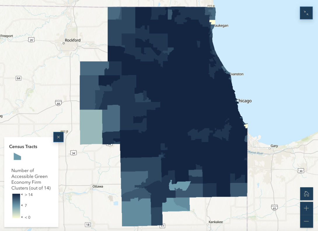
Authors: Aspen Walters and Milo Shapey
The Green Economy is a growing sector of our economy. Currently, the Green Economy workforce is majority white and middle class. Green Economy jobs pay higher wages and have lower barriers to entry than other jobs. Our region must invest in the Green Economy workforce in non-white, lower-income areas in order to increase access to these higher paying jobs. GIS offers tools for spatial analysis that can determine what areas of the region have access to existing firms. This study seeks to determine both the location of Green Economy firms within the Chicago MSA and the level of driving access areas have to these firms. Doing so will shed light on whether or not the Green Economy is as spatially segregated as its workforce is.
2. Access to Rail in Chicago (3D) Heading link
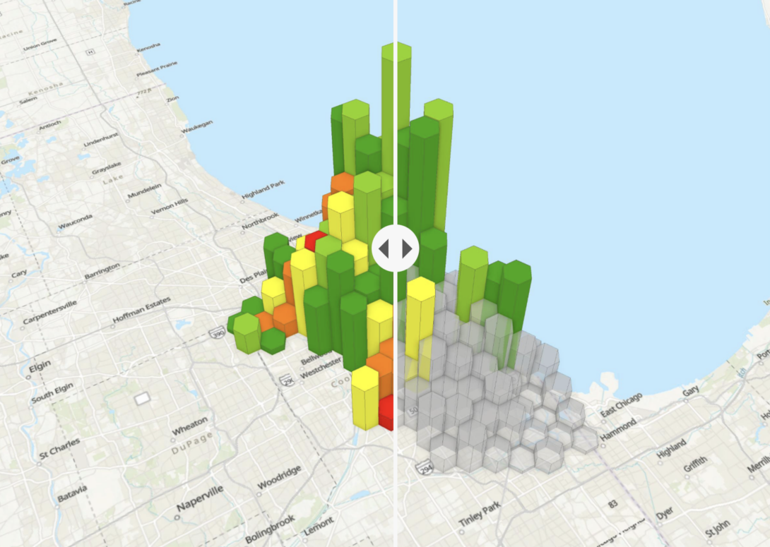
Authors: Jin Jang and Hong Noh
Heavy rail transit is an important part for populations to achieve regional mobility. Trains allow one to travel to jobs or other facilities many miles from their home. The goal of this project is to calculate transit accessibility by analyzing the walk time to the nearest train station. The train station accessibility is analyzed for three scenarios: access for the total population, access to employment, and access for transit dependents. After visualizing the three scenarios, we extract areas with high demand but insufficient transportation accessibility and propose solutions for transportation problems in these areas.
3. The Effect of the Proposed Tribune East Tower on Sunlight: Analyzing Effects in Streeterville, Chicago Heading link
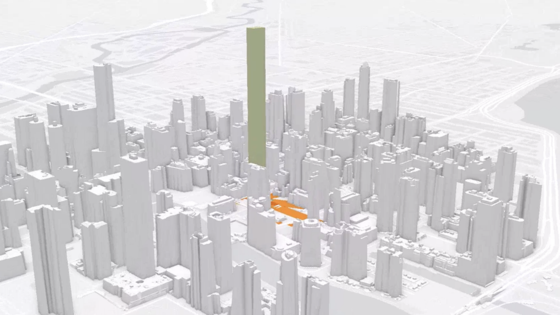
Authors: Mikaela Uddfolk and Soyeon Jang
The Tribune East Tower (TET) is a new proposed mixed-use development in Chicago’s Streeterville neighborhood. It is a new super tall addition to the existing Tribune Tower, which will be renovated as part of the TET development. At 1,422 ft (433.4 m), when completed the skyscraper will be the second-tallest building in Chicago after the Sears Tower. The building plans were approved on May 8th, 2022, but construction has not begun yet. (Reilly, 2020). We hypothesize that the new Tribune East Tower development will have a significant effect on the sunlight of those areas closest to the site.
4. Investigating correlation between historically redlined census tracts and current bus stops in three cities Heading link
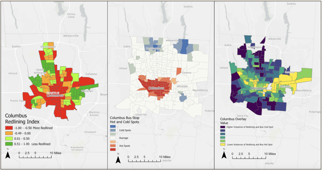
Authors: Julia Hage and Megan Miller
The use of redlining in America in the late 1930’s is attributed to the discrimination and segregation of the nation’s minority populations, especially Black people looking to buy homes in cities and build capital just as White homeowners had been doing decades prior. Redlining was developed through color-coded maps of cities by the Home Owner’s Loan Corporation (HOLC), where different colors indicated mortgage lending risk.
This project looks at historic data detailing redlining from HOLC maps that determines what percent of modern day geography was once part of these redlined areas. We want to see if there is a current spatial correlation with the historically redlined areas and the number of bus stops in different American cities. The geographic study area will be the three largest Midwest cities: Chicago, Indianapolis, and Columbus. Due to prior knowledge of the impact redlining had on Chicago, we chose to explore the two other largest Midwestern cities to see if a similar pattern appears.
5. Pharmacy Deserts in St. Louis Heading link
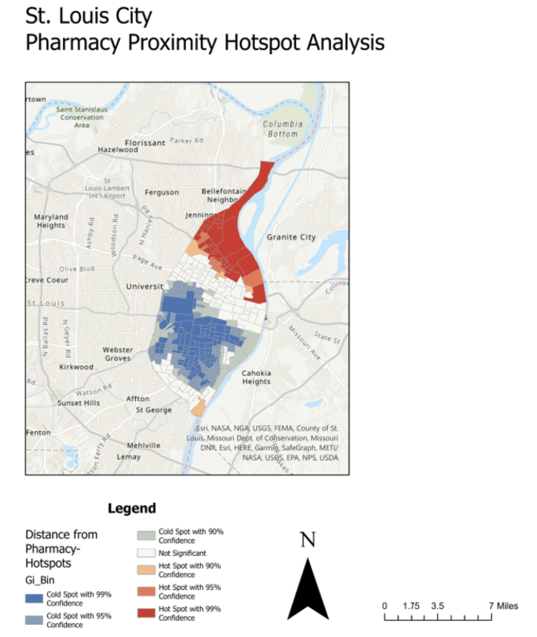
Authors: Nathan Busch and Jonathan Mishory
The concept of “Food Deserts” has become a well-known phrase in the academic and policy spheres as a rural or urban area where residents do not have easy access to nutritional food options within a specific geographic radius. Perhaps less well-known is the similar concept of “Pharmacy Deserts.” This phrase, which was coined in 2014 by Dima M. Qato, refers to areas that are not serviced by pharmacies within a geographic radius of one mile, or a half mile in areas where residents have limited vehicle access.
For our examination, we chose to focus on the city of St. Louis, Missouri. St. Louis is noted for its pronounced racial and socioeconomic divides, sometimes referred to as the “Delmar Divide”, referring to Delmar Boulevard, which divides the city into a more affluent southside with a white majority and a poorer north side with a black majority.
6. Comprehending the link between historic policies and Cities Heading link
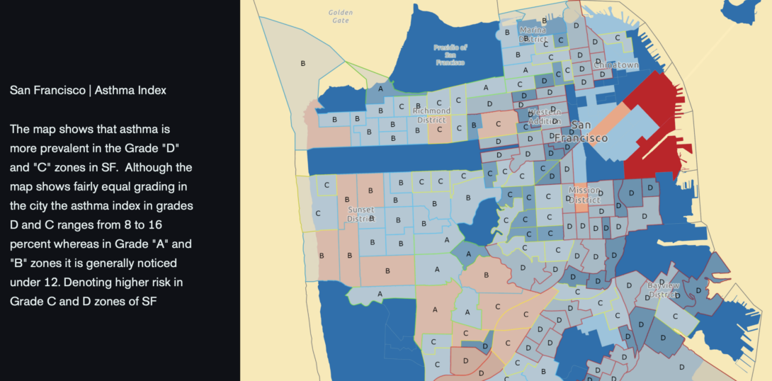
Authors: Kasturi Acharya and Himali Chingale
The consequences of redlining extend beyond the individual families who were denied loans because of the racial makeup of their neighborhoods. Many neighborhoods labeled “Yellow” or “Red” by the HOLC in the 1930s are still underdeveloped and underserved in comparison to nearby “Green” and “Blue” neighborhoods with predominantly White populations. Blocks in these areas are often empty or lined with vacant buildings. They frequently lack basic services such as banking and healthcare, as well as fewer job opportunities and transportation options.
The ArcGIS analysis here attempts to impersonate the effects of the 75-year-old HOLC policy on the modern-day cities of San Francisco and Chicago by understanding the relationship of the following parameters – urban heat island effect, Toxic Release Inventory, Total Population, Median Household Income, Racial Diversity, and Asthma prevalence index in relation to the HOLC census tracts of the two cities by means of the “hotspot analysis ” and “overlay analysis”. The comparison would provide us with a visual and analytical reference as to whether or not these cities in the United States continue to bear the burden of this historic policy even after 50 years of its repeal.
7. Headway Headaches: How CTA Rail Headways Impact Chicago Heading link
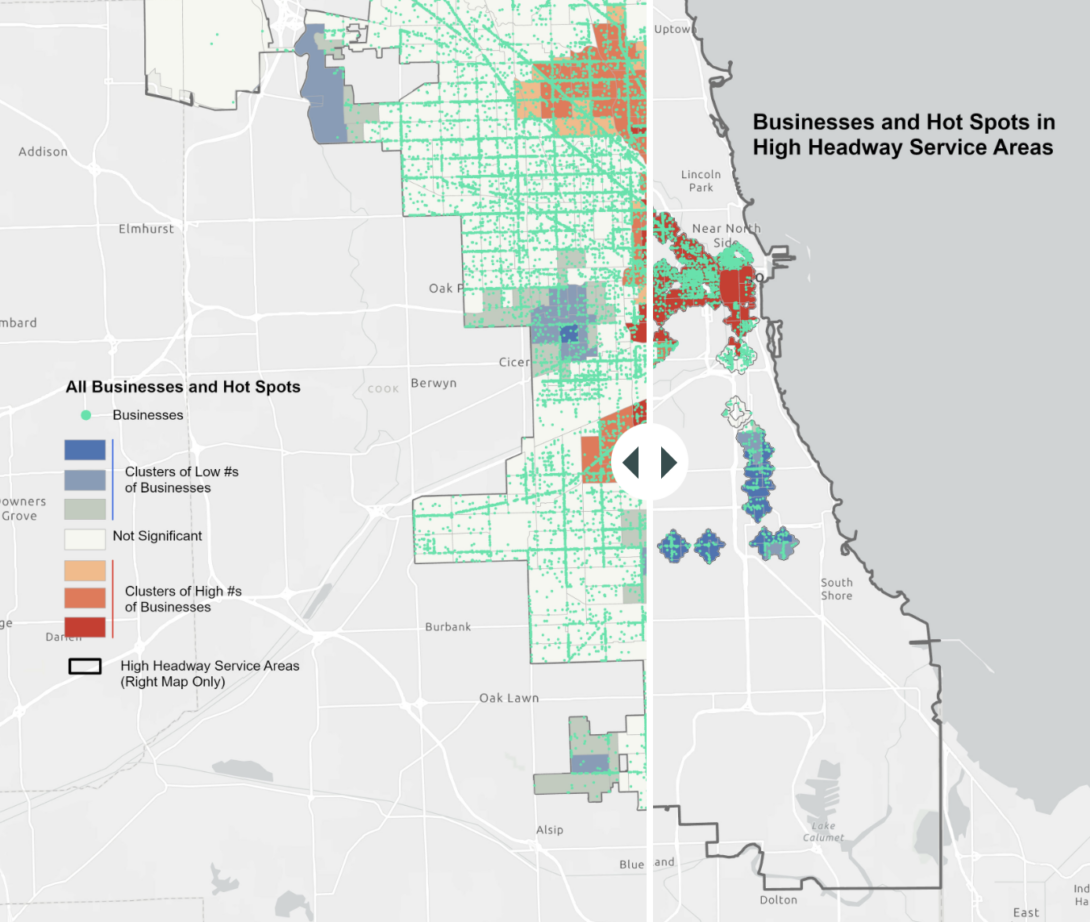
Authors: Brynn Keller and Mimi Stern
While it’s been getting more attention recently, the Chicago Transit Authority has long had a problem with tracker accuracy for trains and buses. Recent data-gathering and activism, such as the work done by Commuters Take Action, fueled by increased reliance on the CTA as workers and residents return to using mass transit after a few years of lower use due to COVID-19, is shining a light on this problem, which is now exacerbated by staffing shortages.
One way of measuring the consistency and reliability of CTA trains is through tracking trains’ “headways.” The headway is the time between one train and the next. This evaluates the actual train’s arrivals themselves, although it does not include the difference between projected and actual train arrivals. In this work, we explain how we analyzed CTA rail headways through the month of October in 2022, and the results from that analysis (Ward, 2022).
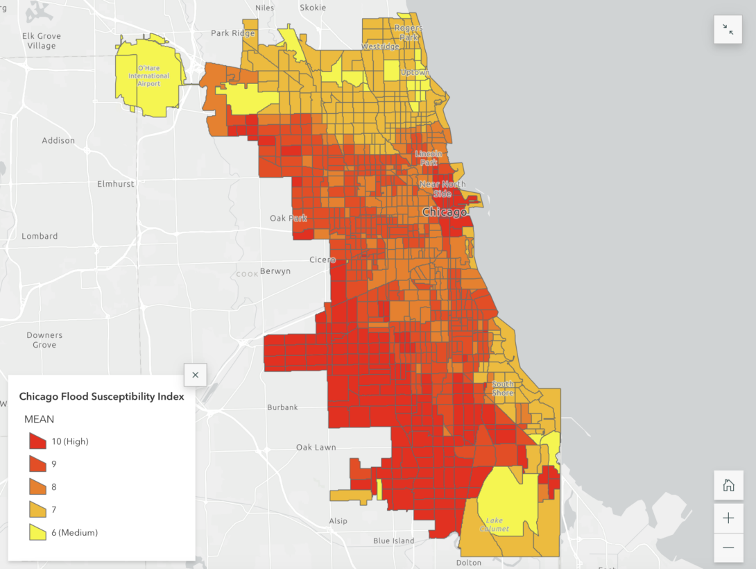
8. Urban Flooding Impacts in Cook County, Illinois: How Urban Flooding Exacerbates the Socio-Economic Disparities for Vulnerable Communities in Cook County? Heading link
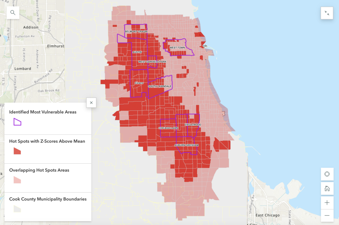
Author: Atefa Ghaznawi
In Cook County, unlike riverine flooding (those areas of the region within the FEMA 100-year floodplain), which has been modeled and studied for years, urban flooding risks have been largely unknown outside of infrequent and individual modeling efforts often carried out by municipalities. Moreover, a community’s geographic location, physical and socioeconomic characteristics, and capacity can significantly influence its degree of vulnerability to flooding.
The impacts analysis will investigate both environmental and sociodemographic factors affecting the population vulnerable to urban flooding. By using GIS, we can identify communities with certain sociodemographic indicators of vulnerability who are more likely to be harmed by impacts of urban flooding and environmental disasters than others. Thus, we can better understand urban flooding risks and damages and propose effective risk mitigation strategies at municipality/community scale.
9. Between Construction Zones, Injuries and Car Crashes Heading link
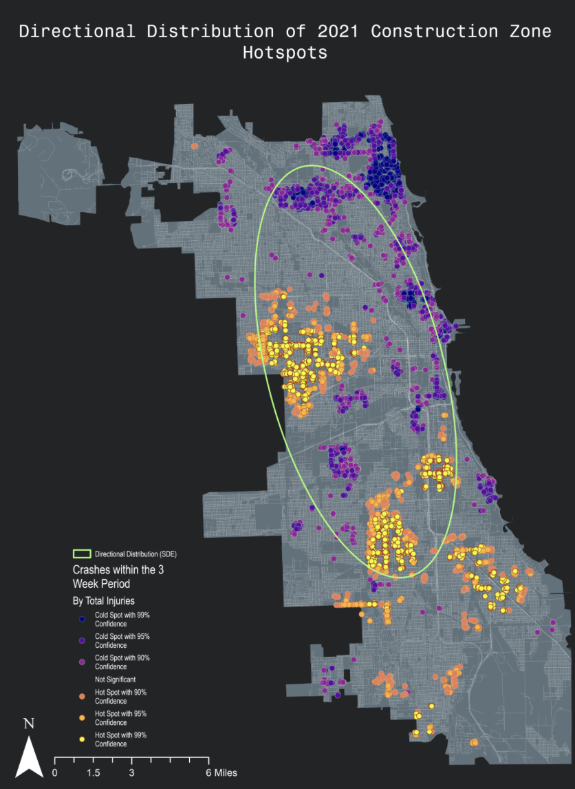
Authors: Max Burns, Juan Daniel Garcia, and Samantha Vega
The preliminary information that was crucial in guiding our research question was partially in due to the rise of car crashes near construction zones. The research question of the study: Does the presence of construction zones produce more vehicular traffic injuries in both the years of 2021 AND 2022? We had our three main variables that we wanted to explore:
- Construction Sites – Independent variable
- Injuries – Dependent Variable
- Vehicular Crashes – Dependent Variable
10. Urban Flooding & Health Equity in Chicago, Illinois Heading link
Authors: Adrian Blasi, Helly Dobariya, and Violeta Lialios-Bouwman
Despite being over 500 feet above sea level and with flat topography, Chicago’s location on the shore of Lake Michigan induces higher than normal precipitation, contributing to urban flooding. Due to the city’s aging infrastructure, particularly with regard to its failing combined sewer system, urban flooding is a major issue that affects already disadvantaged communities more than others.
Using GIS tools like overlay, spatial statistics, and raster analysis to illustrate disparity data and analyze data in its spatial context makes it possible for the city to assess what issues are priorities for residents, what areas are particularly vulnerable, and create plans for addressing these disparities. This is an essential process for the public health field in particular as these types of maps are used in Community Health Needs Assessments and when combined with environmental justice datasets can be put to use in the context of Health Equity in All Policies .
11. Hot-Spot Analysis of Chicago's Nonprofit Services Heading link
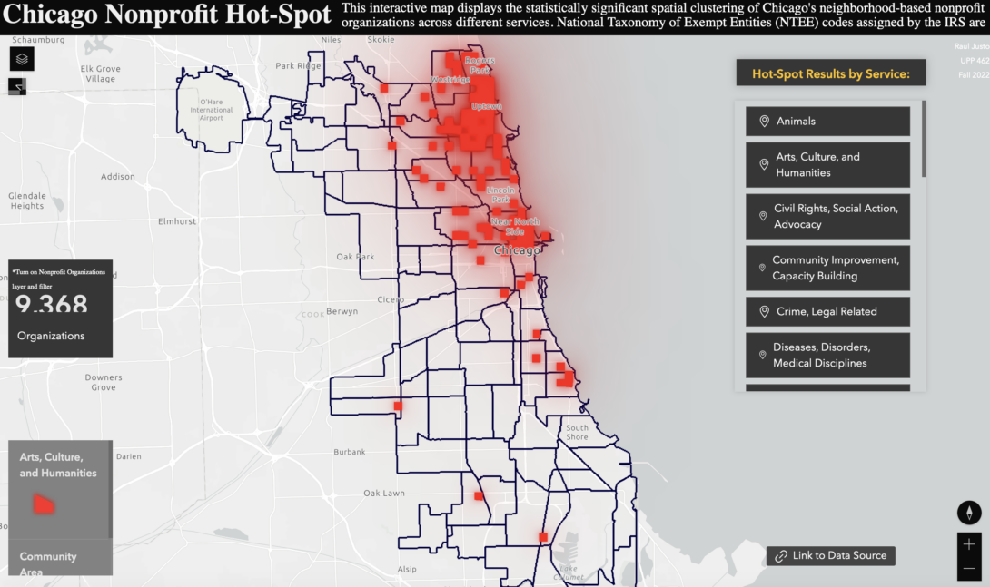
Author: Raul Justo
Link to Experience Builder Map
Section 501(c)3 of the Internal Revenue Services (IRS) code provides tax-exempt status to organization that have no private interests and are not for profit. In the 2021 tax-year, there were 13,762 501(c)3 organizations in Chicago. Clearly, the city is not short of nonprofit organizations. Because there is a large number of organizations across the city, it is difficult to identify significant clusters by simply visualizing their location. While we can classify each organization by services type and record its frequency across community areas, it does not disclose whether their spatial distribution is statistically significant or not.
Hot-Spot analysis will demonstrate whether clusters (or lack of clusters) of different nonprofit services are statistically significant. The results will provide a basis to compare and observe different spatial patterns across geographies and demographics with relation to the clustering of nonprofit services. This is the first step in exploring “where” and “who” has more access to certain type of nonprofit services than others.
12. Industrial Clusters in the Chicago Metropolitan Area Heading link
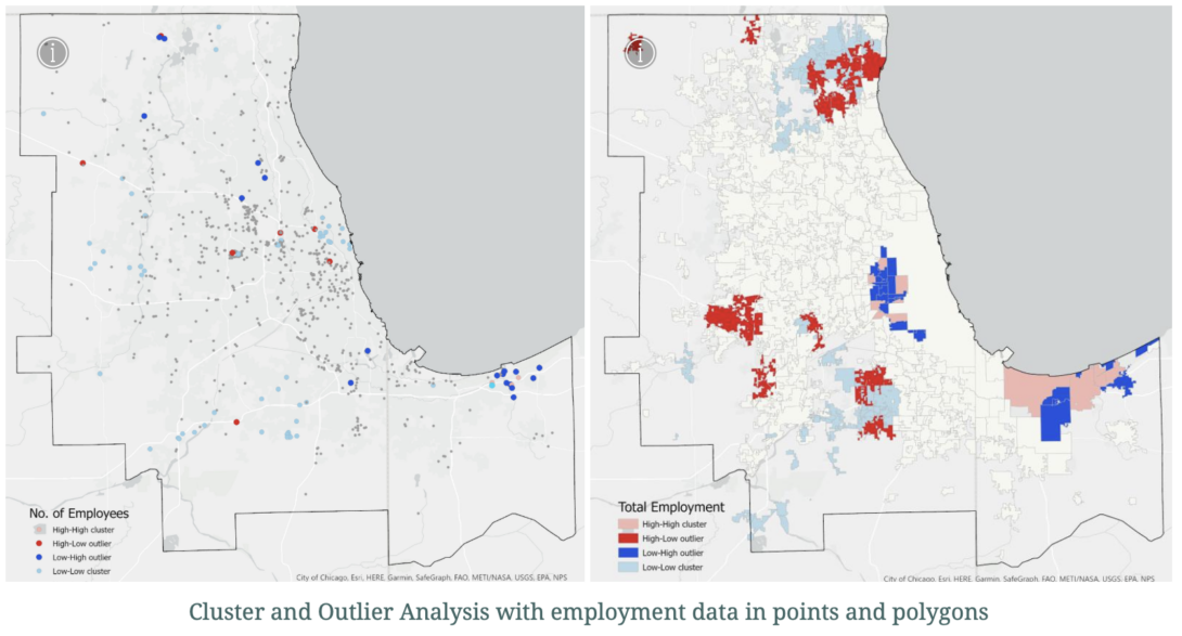
Author: Rodrigo Resck
This project will research the location of industrial and manufacturing businesses in the metropolitan area of Chicago. More specifically Primary Metal and Fabricated Metal Product Manufacturing (NAICS code’s 331 and 332). These two industries are usually considered as having an important presence and competitive advantages in the region.
One initial hypothesis is that there is a geographical clustering of the Primary Metals because of their environmental impact. Therefore concentrating in the area of Indiana Harbor where the big foundries and mills are traditionally located. There might be both dispersion and clusters of Fabricated Metals, within the City of Chicago and the suburbs because they are more compatible with other uses. The use of more granular data now available from the Business Analysis tool in ArcGIS Pro will let us explore the spatial patterns at almost parcel level, something which is not available from traditional census datasets.